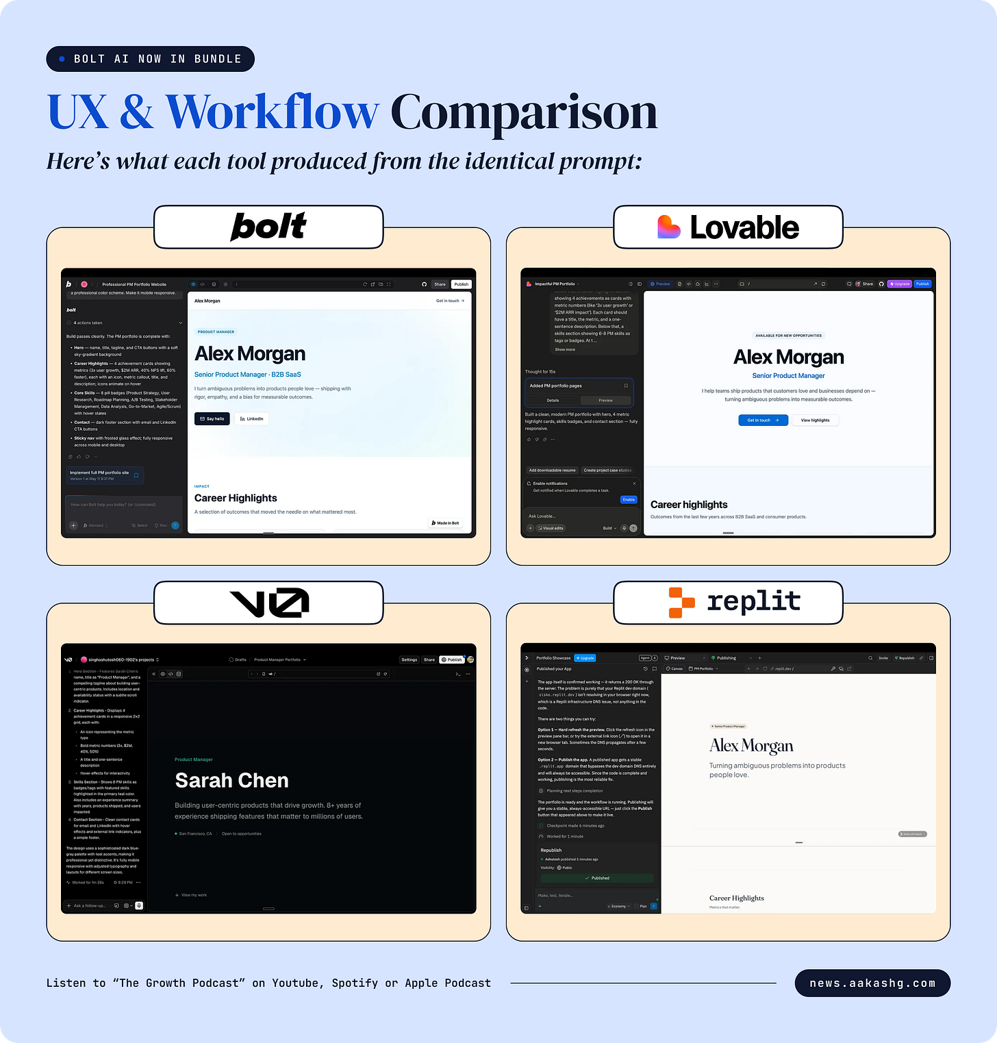
I ran the same feature through Bolt, v0, Lovable, and Replit. Same prompt. Same feature. Same browser width. Here’s what happened.
I built a PM portfolio page: hero section with name and tagline, career highlights as metric cards, a skills section, and a contact area. This is relevant to PMs (portfolio content is one of my most-read topics), visually rich enough to show design quality differences, and simple enough that all 5 tools can handle it.
The exact prompt used:
“Create a professional PM portfolio website with a hero section showing the PM’s name, title, and a short tagline. Below that, a career highlights section showing 4 achievements as cards with metric numbers (like ‘3x user growth’ or ‘$2M ARR impact’). Each card should have a title, the metric, and a one-sentence description. Below that, a skills section showing 6-8 PM skills as tags or badges. At the bottom, a simple contact section with email and LinkedIn link. Use a clean, modern design with a professional color scheme. Make it mobile responsive.”
Here’s what each tool produced from the identical prompt: